Obama Poll Watch -- November, 2012
Obama Triumphant
Before we get to all the polling and charting fun, we've got to say that it's a relief not to have to explain the difference between these columns -- which measure Obama's job approval numbers -- and the "horserace" of the presidential election campaigns (or "which candidate are you going to vote for?"). This, of course, is due to Obama's spectacular re-election, where he held Mitt Romney to (snicker) 47 percent of the popular vote. O, the irony! O, the poetic justice! Heh.
Electioneering aside, this also leaves us to ponder the fact that this column series will not go gently into that good night come January, but instead will continue for the next four years. Which leads to certain questions: Should the second term be handled separately, or smushed all into one chart? Is there anything annoying about the charts as they stand (is there room for improvement, in other words)? The dividing line between presidential terms seems the perfect time to make any adjustments, so if you have any suggestions, feel free to make them in the comments. I'm open to ideas, folks.
With that housekeeping out of the way, let's have a look at Obama's job approval numbers during the month he got re-elected, starting with the big chart.
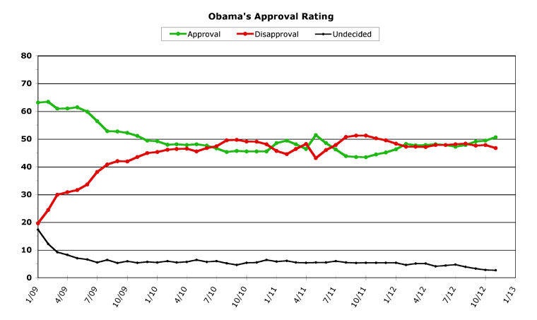
[Click on graph to see larger-scale version.]
November, 2012
November was certainly good to President Obama. He won the election at the beginning of the month, and he's been riding a "bounce" in the polls ever since. There are two notes of caution here, though, for Obama fans. The first is that he barely squeaked over a critical benchmark, even though he's remained above it ever since. The pollsters' rule of thumb for presidential re-election chances is that any president with job approval over 50 percent will likely win a second term. Presidents below 45 percent are likely going to lose. The area in between is dangerous territory for any president to find himself in during a campaign, but that's precisely where Obama spent almost the entire period.
Almost. Because on the day of the election, his daily average job approval finally topped the mark, by a hair, at 50.1 percent. This was the first time Obama had beaten the halfway mark since the death of Osama Bin Laden. But he barely got there. Which should be a sobering thought.
The second reason that this month might be somewhat of a false bounce is the paucity of data. Everyone spent a whale of a lot of time, money, and effort polling before the election, but since then nobody's been very interested. After all, you don't need a public opinion poll when you have the poll results from the ballot boxes right in front of you.
What this meant is that this month's numbers are largely an aggregate of two polls -- the "rolling daily" polls from Rasmussen and Gallup. Now, neither one of these organizations did a very good job in the weeks leading up to the election, so their numbers are somewhat suspect, even if they are very high for Obama at the moment (both have reached into the mid-50s, approval-percentage-wise, since the election). But more data is really needed to see how high Obama's polling bounce truly is at the moment, and whether it'll have any lasting power, considering the busy month of politics December's going to be.
But enough with all the caveats. Let's take a look at November's numbers. Obama got better than a whole percentage point improvement in both his job approval numbers and his disapproval numbers. For the month, Obama averaged 50.6 percent approval, up 1.2 points from October. This is the fourth month in a row Obama's approval has been up, for a combined total of 3.4 percent. Obama's disapproval monthly average fell to 46.7 percent, a 1.1 point drop. In both cases, this is the best Obama's done since the Bin Laden bounce. For job approval, if you don't count the Bin Laden bounce month, this is the first time Obama's been over 50.0 percent for a month since November, 2009.
The "undecided" line on the graph hit a new low, as the electorate polarized for the election. Only 2.7 percent didn't have an opinion about Obama's job performance, a number that is more normally twice as large. This number will likely rise in the next few months, so it'll be interesting to see whether it affects the approval numbers or the disapproval numbers by doing so. Obama finished the month 3.9 percent "above water" -- a gap between approval and disapproval that is more than twice as big as he's managed all year long (he was "below water" as recently as August).
All in all, a pretty triumphant month for the president, no matter how you look at it.
Overall Trends
Before we get to the trends for the future, we have some "old business" to finish up. Last month, this column closed with a comparison chart between George W. Bush and Barack Obama, heading into their respective re-elections. The column's final thoughts:
Bush's approval right before the 2004 election was 48.3, and his disapproval was 47.3. Obama's approval right now bests Bush's by 1.1 percent.
Which leads to our final thought: George W. Bush won re-election, even with polling in almost exactly the same territory Obama is now in. This is no guarantee, but it certainly is interesting.
We decided to create a much closer look at this phenomenon, and we came up with the following chart, which tracks Obama and Bush roughly through the general election period (from February to November of 2004 and 2012):
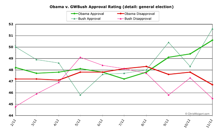
[Click on graph to see larger-scale version.]
That's pretty close. Smooth Bush's lines out a bit and they almost exactly match Obama's. Both men struggled to get above 50 percent, and only managed it at the very end.
Now, I'm not making predictions here, but it is worth contemplating, since Bush went on to have what can (even charitably) only be called a disastrous second term, polling-wise. I'm not saying Obama is (or isn't) headed for the same territory, just pointing out the closest parallel between Obama's second election year of any president back to Truman. At times in his first term, Obama has matched other presidents (Reagan, Carter, and Clinton, for instance), but in his second election year, he almost perfectly tracked none other than George W. Bush.
Future trends are tough to predict, at this point, for two big reasons. The first is the thin nature of the data for November. It's hard to tell what the trend will be if you don't have numbers to crunch. The second reason is that nobody knows how the fiscal cliff negotiations are going to work out -- which could have profound impacts on Obama's job approval rating in December and beyond.
But let's look at Obama's detailed chart to see what can be teased from what we've got.
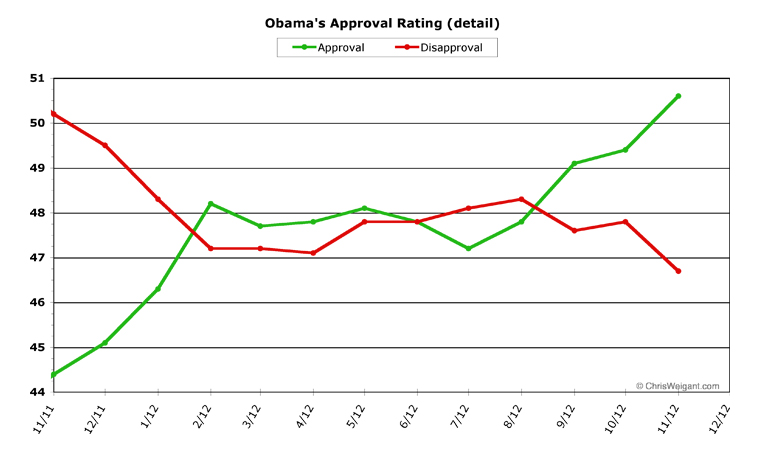
[Click on graph to see larger-scale version.]
This may be the last time I have to run one of these "let's look at things under a magnifying glass" charts, because hopefully the main chart will show movement more clearly now that Obama's approval and disapproval numbers aren't occupying the same space on the chart.
Looking at the daily averages, Obama's job approval started off November at 49.9 percent, which would turn out to be his low point for the entire month. He hit a high of 51.3 on the 19th, and closed the month at 51.0 percent. His disapproval numbers showed a similar trend, starting at a high of 47.4 percent and falling to a low of 46.0 percent in the last week. Obama finished up with 46.3 percent average daily disapproval.
But these numbers hide an even bigger positive trend for Obama. The way RealClearPolitics.com creates their daily averages (where we get our data from for all these charts), they add in either roughly the past two weeks of polling, or the past six-to-ten polls. But because only two polling organizations polled post-election, there were three or four polls taken right before the election that got added in all month long (due to the lack of other pollsters releasing numbers, in other words). So Obama, for instance, carried two polls of only 49 percent approval all month long, even when Rasmussen was giving him 55 percent. That dragged Obama's post-election bounce down somewhat. Meaning that for the first half of December, Obama's numbers are likely to improve, perhaps dramatically. His approval number could very easily jump up to 52 or even 53 percent in the next week or so.
The end of the month is going to be fiscal cliff time, but Obama seems pretty well positioned for the first phase of this Kabuki drama. He's got public opinion behind his position, and the wind at his back politically from the election. If the talks blow up and we go over the cliff, that's not going to affect December's numbers as much as January's, since it'll likely happen at the very end of the month.
So while things will be entirely up in the air in January, it's a pretty safe bet that Obama's approval ratings will continue to improve next month. Since his initial "honeymoon" period in 2009, his highest monthly average job approval was the Bin Laden bounce, where he hit 51.4 percent in May, 2011. Right now, it's entirely possible Obama will best even this high-water mark when December's numbers are in.
[Obama Poll Watch Data:]
Sources And Methodology
ObamaPollWatch.com is an admittedly amateur effort, but we do try to stay professional when it comes to revealing our sources and methodology. All our source data comes from RealClearPolitics.com; specifically from their daily presidential approval ratings "poll of polls" graphic page. We take their daily numbers, log them, and then average each month's data into a single number -- which is then shown on our monthly charts here (a "poll of polls of polls," if you will...). You can read a much-more detailed explanation of our source data and methodology on our "About Obama Poll Watch" page, if you're interested.
Questions or comments? Use the Email Chris page to drop me a private note.
Column Archives
[Oct 12], [Sep 12], [Aug 12], [Jul 12], [Jun 12], [May 12], [Apr 12], [Mar 12], [Feb 12], [Jan 12], [Dec 11], [Nov 11], [Oct 11], [Sep 11], [Aug 11], [Jul 11], [Jun 11], [May 11], [Apr 11], [Mar 11], [Feb 11], [Jan 11], [Dec 10], [Nov 10], [Oct 10], [Sep 10], [Aug 10], [Jul 10], [Jun 10], [May 10], [Apr 10], [Mar 10], [Feb 10], [Jan 10], [Dec 09], [Nov 09], [Oct 09], [Sep 09], [Aug 09], [Jul 09], [Jun 09], [May 09], [Apr 09], [Mar 09]
Obama's All-Time Statistics
Monthly
Highest Monthly Approval -- 2/09 -- 63.4%
Lowest Monthly Approval -- 10/11 -- 43.4%
Highest Monthly Disapproval -- 9/11, 10/11 -- 51.2%
Lowest Monthly Disapproval -- 1/09 -- 19.6%
Daily
Highest Daily Approval -- 2/15/09 -- 65.5%
Lowest Daily Approval -- 10/9/11 -- 42.0%
Highest Daily Disapproval -- 8/30/11 -- 53.2%
Lowest Daily Disapproval -- 1/29/09 -- 19.3%
Obama's Raw Monthly Data
[All-time high in bold, all-time low underlined.]
Month -- (Approval / Disapproval / Undecided)
11/12 -- 50.6 / 46.7 / 2.7
10/12 -- 49.4 / 47.8 / 2.8
09/12 -- 49.1 / 47.6 / 3.3
08/12 -- 47.8 / 48.3 / 3.9
07/12 -- 47.2 / 48.1 / 4.7
06/12 -- 47.8 / 47.8 / 4.4
05/12 -- 48.1 / 47.8 / 4.1
04/12 -- 47.8 / 47.1 / 5.1
03/12 -- 47.7 / 47.2 / 5.1
02/12 -- 48.2 / 47.2 / 4.6
01/12 -- 46.3 / 48.3 / 5.4
12/11 -- 45.1 / 49.5 / 5.4
11/11 -- 44.4 / 50.2 / 5.4
10/11 -- 43.4 / 51.2 / 5.4
09/11 -- 43.5 / 51.2 / 5.3
08/11 -- 43.8 / 50.7 / 5.5
07/11 -- 46.2 / 47.8 / 6.0
06/11 -- 48.5 / 46.0 / 5.5
05/11 -- 51.4 / 43.1 / 5.5
04/11 -- 46.4 / 48.2 / 5.4
03/11 -- 48.1 / 46.4 / 5.5
02/11 -- 49.4 / 44.5 / 6.1
01/11 -- 48.5 / 45.7 / 5.8
12/10 -- 45.5 / 48.1 / 6.4
11/10 -- 45.5 / 49.0 / 5.5
10/10 -- 45.5 / 49.1 / 5.4
09/10 -- 45.7 / 49.7 / 4.6
08/10 -- 45.3 / 49.5 / 5.2
07/10 -- 46.6 / 47.4 / 6.0
06/10 -- 47.6 / 46.7 / 5.7
05/10 -- 48.1 / 45.5 / 6.4
04/10 -- 47.8 / 46.5 / 5.7
03/10 -- 48.1 / 46.4 / 5.5
02/10 -- 47.9 / 46.1 / 6.0
01/10 -- 49.2 / 45.3 / 5.5
12/09 -- 49.4 / 44.9 / 5.7
11/09 -- 51.1 / 43.5 / 5.4
10/09 -- 52.2 / 41.9 / 5.9
09/09 -- 52.7 / 42.0 / 5.3
08/09 -- 52.8 / 40.8 / 6.4
07/09 -- 56.4 / 38.1 / 5.5
06/09 -- 59.8 / 33.6 / 6.6
05/09 -- 61.4 / 31.6 / 7.0
04/09 -- 61.0 / 30.8 / 8.2
03/09 -- 60.9 / 29.9 / 9.2
02/09 -- 63.4 / 24.4 / 12.2
01/09 -- 63.1 / 19.6 / 17.3
-- Chris Weigant
Cross-posted at Business Insider
Cross-posted at The Huffington Post
Follow Chris on Twitter: @ChrisWeigant


Chris you were doing well till you went to the poxy math. All our Mr.O. has to do is say no to any "Grand Bargain",we will have his back.
Should the second term be handled separately, or smushed all into one chart?
i would prefer to see a single curve on a longer chart, rather than term one overlaid on term two.
Americulchie -
So far, things are looking good. O's standing pretty firm on the rate increase. We'll see...
nypoet22 -
My main thinking on handling the two separately is that the first term's "honeymoon" was so large and so extended that it kind of threw off the rest of the graph. If I had a "Term 2"-only graph, then it might be easier to see when O hits high points or low points.
But I'm still pondering. Anyone else have a preference?
-CW
Chris you were doing well till you went to the poxy math. All our Mr.O. has to do is say no to any "Grand Bargain",we will have his back.
Yea, we don't need to do any stinkin' compromisin'!!!!
What a difference in the attitude on compromise, eh??
Who would have been able to predict it..
Oh wait.. I *DID* predict it!!! :D
Michale
0163
But I'm still pondering. Anyone else have a preference?
How about not showing any polls until the approval numbers are in the low 20s where they belong?? :D
hehehehehehehe
Michale...
0164
Michale,
You're up to 163 comments already and I'm still wondering where the kittens are ...
Chris,
But I'm still pondering. Anyone else have a preference?
I think you should focus on just the high points, regardless of graph format.
You're up to 163 comments already and I'm still wondering where the kittens are ...
Word is they will make their grand debut today :D
Michale
0166
To all -
Kittens today... I promise!
:-)
-CW
Michale -
"low 20s"?? I think you got mixed up by that detail chart. Dubya was the one who beat Tricky Dick's record, down in the low 20s. Obama hasn't ever dipped below 40, sorry.
O's daily for yesterday was 51.8 approval... and climbing...
:-)
-CW
"low 20s"?? I think you got mixed up by that detail chart. Dubya was the one who beat Tricky Dick's record, down in the low 20s. Obama hasn't ever dipped below 40, sorry.
O's daily for yesterday was 51.8 approval... and climbing...
Are you TRYING to depress me!? :D
Michale
0184
My thought is that the main graph should show the whole two terms, but cut off the top and bottom at 70% and 15% respectively. Now it goes all the way down to zero, which you need if you're going to show Undecided on the same graph. If Undecided ticks up enough to be interesting, give it its own detail graph or include it on one of the detail graphs with a separate scale.
Another way to do a detail graph (including Undecided) would be change in each over some time period, so they all start at zero on the left side of the graph.
Michale -
I'm just trying to see if that counter can turn over 1000... heh.
dsws -
The top rate is set at 80 so that this chart is easy to use in comparison to all the other presidents (see the left sidebar on ObamaPollWatch.com). It was a compromise -- 100 squished the chart too much, but I wanted one number I could use for all. Two recent presidents (both named Bush) went above 80 percent briefly (war-time bounces for both), but I still thought 80 was a good choice.
But I'll play around with the scale, and see what others look like.
Maybe I should have one chart with just term2, and one that shows his whole time in office. That way, I could get tighter on the term 2 chart, and keep the big chart at 80. Like I said, this is an interesting idea, so let me play around with it and see what things look like.
-CW
CW[3],
my issue is just that the more lines a graph has, the more difficult it is to read, much less explain to a seventh grader. overlapping (e.g. this week's BHO vs. GWB) makes the chart look busy and tangled. so i tend to prefer a longer chart with fewer lines rather than extra lines on the same chart. in my not so humble opinion, less can frequently be more.
~joshua
joshua -
I tried a 2-term chart, and it looked a little weird until I took out the dots. As just lines, it wasn't too bad. Maybe I'll mock-up a few different ones of these and run them by everyone next month. There are a lot of different ways to tinker with the charts....
Pledge drive column will be up anon, everyone...
-CW
Michale,
So, you'll be pledging five bucks per comment, as I recall. Because, Obama won, right? And, your good pal, Chris1962 - Hurricane Sandy, notwithstanding - will be matching dollar for dollar, I surmise.
And, I'll be searching for a second job just to cover my end of the bargain. :)
So, you'll be pledging five bucks per comment,
Whoa now... $1 per comment... :D
If it were $5 a comment, I would have to stop commenting right now! :D
Michale
0196
And, I'll be searching for a second job just to cover my end of the bargain. :)
Yea, I know the feeling.. I'm gonna have to put in some OT hours at the shop...
There is an saying in my old unit.
"Sleep is a habit that one CAN overcome"
Guess we're gonna find out if this is true or not..
:D
Michale
0197
Michale,
No, my friend, I'm pretty sure the deal was $5 per comment.
Sooooo, you're almost at the $1000 mark and then you can give us a break ... I mean, take a break for the rest of the year! Heh.
Noooo, I am pretty sure that the bet was for me to double my donations if Obama won and ya'all to double my donations if Romney won..
Now, it's not outside the scope of possibility that I did say $5 per comment....
"I get hit in the head a lot"
-Dan Marino, ACE VENTURA: PET DECTIVE
:D
.... but I am pretty sure it was $1 per comment..
Michale
0208
CW,
Maybe I should have one chart with just term2, and one that shows his whole time in office.
I like this idea, personally, if it is not too cumbersome to maintain.
ninjaf -
Maintaining them isn't even really an issue. Once I get the chart set up, it maintains itself from the same table of data as all the other charts. I think what I'll do is try to come up with 3-5 charts next month for possibilities, and then let everyone have their say as to which they like best. It'll take some work over the New Year's break, but it shouldn't be that big a deal.
-CW
Announcement -
This really should be over at Tuesday's column, but adjucation seems necessary here, so...
In the spirit of anti-Norquistianism sweeping the countryside (one would like to hope, at any rate), I hereby release everyone from any rash "pledges" made during election season. During an election runup, we all say silly things we just know we'll regret later (and I do include myself in that). It's not just politicians, in other words.
So, from the official kickoff of the pledge drive forward, everyone is free to make pledges as to what they'll be donating. All previous pledges are hereby null and void.
How's that? Everyone can live with that, right?
Here's a piece of advice, too, for those who are playing the comment-counting game. If it makes no difference to the way you're setting your finances up, then it is MUCH BETTER for our coffers if you save it all up and send it all in at the end, rather than making small donations every few days. This is because of the way PayPal works (their fee structure) -- more of the money comes to us from a $50 donation than it would from five $10 donations, to put it another way.
Just a plea, for those doing "rolling pledges"...
Thanks, and happy holidays once again to all!
- CW
anti-Norquistianism
Say THAT 3 times fast!! :D
I'll stick with my pledge simply because it's just... well.. me :D
Besides, counting posts is the highlight of my year.. :D
Michale
0220