Reader Poll
OK, I've been meaning to do this for a while now, but it just wasn't possible before last month's Obama Poll Watch chart (which was done right after New Year's Eve, I would point out in my defense), and I haven't gotten around to it. Until now, that is!
Since Barack Obama is going to be president for another four years, we are going to take the chance to slightly upgrade our charts of his approval ratings. So I spent the afternoon playing around with Excel, and came up with a few directions I'm considering. And I thought I'd run them by everyone, to see what people thought.
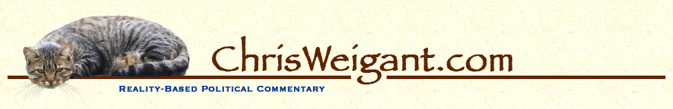
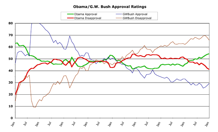
To refresh your memory, here's what last month's chart looked like (click on any of these to see a larger copy):

This actually brings up an initial question: are the "larger" charts large enough? Should they be bigger? Right now, they're about 750 pixels wide, but I could easily change that to just about any size, so let me know if they're not big enough to adequately see details.
Now, on the ObamaPollWatch.com site, I have three or four chart types. The first is Obama's chart, as seen above. The second category is of term-by-term charts for all previous presidents back to Eisenhower (still haven't dug out what little polling data there is on Truman and F.D.R. -- before Roosevelt, public polling information is pretty much non-existent). The third is a series of president-by-president comparisons of Obama's record with all his predecessors. And the fourth is the occasional "detail" chart I run in the columns, but don't archive as I do the other categories.
OK, for the individual presidential term charts, I've long wanted to do something along the lines of this:
I think that adding a few labels for important opinion-changing events helps people to put the opinion polling into a bit of historical context. I wouldn't try to mark every important event in every president's term, but rather the ones which seem to have had consequences in the polling. A couple of caveats for the above chart are necessary. One, these are all sample charts and I didn't bother fact-checking them or anything, so those lines may be off by a month or two. Two, Obama's numbers for the current month appear in these sample charts, so just ignore them as they are (obviously) preliminary.
So, what do you think? I did the labels in two sizes of font (the two on the right are slightly bigger), so let me know which side you like better.
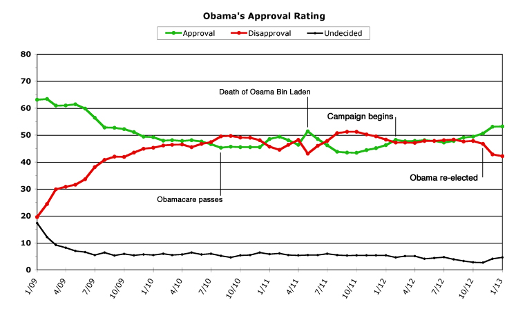
OK, on to the second term issues. The first question is should I just chop off Obama's first term as its own chart, and then start a new blank chart (identical to those above except for the dates on the bottom scale) for his second term? Or should I put both together in one chart which shows eight years? Here is what I came up with (I removed the data "dots" because in this scale they looked rather odd):
The problem with this longer-scale chart is that it is going to move very slowly, month-by-month, which might make it tough to see changes. Of course, I could always run detail charts if need be (most of my detail charts have been "for the past year" which would fix the problem). Anyway, let me know what you think of the "two-terms-in-one" chart format.
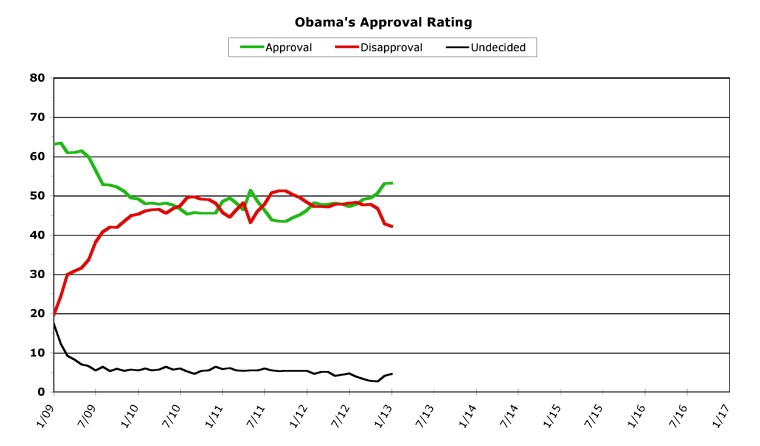
One idea that has been suggested is to widen the vertical scale (as I have done on my detail charts previously), so that smaller changes can be seen more easily. Here's a chart which shows almost every data point (the first disapproval number in January 2009 is a bit off the chart, but hey, close enough...) from Obama's first term, to show what this could look like:
Personally, I'm not a big fan of this option, for a number of reasons. One, it means losing the "undecided" data line, which I think is important to have up there. Two, the reason why I set the scale from 0 to 80 was to have a standard that all presidents could be displayed against (a few presidents have topped 80 percent, but only very briefly). So for the sake of standardization, I'm not really a fan of making the expanded scale the default monthly chart. But I could be convinced, if everyone else disagrees, so let me know.
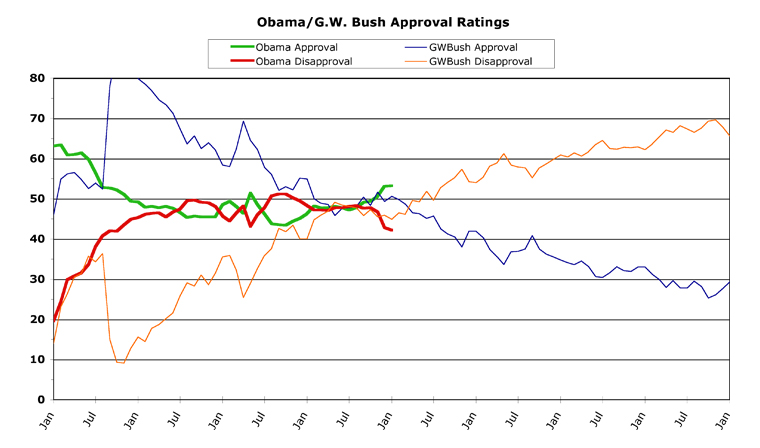
OK, I saved the best part for last, because this is one I think everyone will like. Previously, in comparing presidents, I have smushed two terms onto one chart in an even stranger way. Here is Obama versus George W. Bush from last month, for example:
There are three sets of lines, one for Obama, one for Bush's first term, and one for Bush's second term. This makes the chart awfully "busy" (which is a polite way of saying "confusing"). Now that Obama has won a second term, all presidents can be shown against each other thusly:
What will make my job even easier is that I will only have to do these charts for multi-term presidents, and will be able to just make a "complete" first-term comparison chart for the one-termers (George H. W. Bush, Carter, Ford, and Kennedy). This will cut down the number of charts I have to generate each month.
But I think everyone can agree that the last chart is a lot easier on the eyes than how I've been showing two-termers up until now.
Anyway, that's all I've got for now, but I'm certainly open to any other suggestions for improvement. Let me know your thoughts on any or all of the above in the comments. Hopefully I'll be able to roll out the changes starting at the end of this month.
-- Chris Weigant
Follow Chris on Twitter: @ChrisWeigant


WOW!
Bush topped 90% approval!!!??? :D
I like the charts that show detail.. I also love the charts that have the labels...
And the multi-term charts, while looking "busy" are still pretty good..
My 2 cents.
Michale
Michale -
Actually, that's 80 percent at the top of the chart.
In fact, both Bushes topped 80 percent at one point. GHWBush for the Gulf War I, GWBush for 9/11.
In one or two polls, each may have topped 90 (that's what I remember at any rate), but their monthly average was in the 80s.
Anyway, does anyone else have opinions about the charts???
Do tell.
-CW
Actually, that's 80 percent at the top of the chart.
I just extrapolated.. The DISAPPROVAL fell below 10% (looks like 9%) so that means that the approval had to be 91%. Of course, not accounting for undecideds..
I am sure in the aftermath of 9/11, there wasn't any undecideds.. :D
Michale
Michale -
Well, I seem to recall both Bushes very briefly topped 90% in at least one poll. It was an all-time record, beating (I'm guessing) either Eisenhower or JFK. Of course, polling only goes back to about the middle of FDR, so that's a limited record at best. No data on how George Washington would have polled, in other words.
The stratospheric ratings both Bushes got were the "rally 'round the president" effect, which always happens in times of war or great crisis. The odd thing is that Obama didn't spike even higher on killing OBL -- usually this effect is more pronounced. But it also usually fades away as well. Dubya Bush rode his bounce longer than most, I should add. His numbers didn't come back to where they previously had been for 2 years (of course, he started a second war in that period, which gave him a more-minor second bounce as well).
Anyway, where's everyone else? Nobody has any chart thoughts? I miss Chris1962, hope things are going well for her rebuilding efforts...
:-)
-CW
Get rid of the undecideds (perhaps a small note that the numbers don't add to 100% due to undecideds, or include a side not of where undecideds are at given points in time). This allows you to rescale the vertical axis to expand the view. I would probably use something like a 25-75% range on the vertical axis.
I don't see the undecideds as being all that useful and I think that for comparisons, you could either expand the vertical axis scale when necessary, or let someone "blip" off the graph for brief periods. Not a big deal when that happens. The point of that data gets made either way.
If there's something interesting in a comparison of presidents and the undecideds, you could always put that out as a separate chart.
Adding point-in-time notes to the "Obama's Approval Rating" chart is a good change. I like it for the individual presidential term charts. I think your filters (choice of what to include and omit) are perfectly reasonable so far.
I think that a second-term chart rather than a running total is the way to go to present data for the coming four years. I think the comparison to other second-term presidents is the most useful and avoids the smoothing you discuss.
I would maintain both terms chart, for archival purposes and a general comparison, but it wouldn't be the primary data presentation.
I definitely prefer the second of the Obama-Bush comparison charts. Much less busy.
The odd thing is that Obama didn't spike even higher on killing OBL -- usually this effect is more pronounced.
I didn't want to say it, but I am certain that it just burns Obama's ass that he has never hit the popularity that Bush had...
I too have wondered why Obama's OBL numbers weren't higher. My guess is that the well is poisoned beyond any hope of redemption...
Which is a shame...
About the only thing that could re-unite this country would be a truly earth-shattering event..
I miss Chris1962, hope things are going well for her rebuilding efforts...
I dropped her an email last week wanting to see how she's doing... I hope she's OK... But she's tough.. She's probably running the entire SANDY cleanup!! :D
Michale....
Sandy recovery is proceeding.
My folks in Rockaway Beach, NY, received a settlement check (FEMA, Insurance) covering the work needed. My in-laws (also in Rockaway) also received $ and are able to have a livable space before summer.
It isn't always pretty or smooth, but it isn't a cluster either. They're moving forward slowly, but relatively smoothly.
Thanx for the update, S2...
We feel for your relatives that were in harms way.
Being a Floridian, we have been there and they have our utmost empathy for their plight..
Michale