
The Heisenberg Effect Of Televising Political Negotiations
I'm going to start off today's column with a chart. I'm doing this for several reasons, not least of which is the fact that it's a really good chart. It is simple, easy to read, and involves very little mathematics (meaning it is accessible to a very wide spectrum of the American public). And it is a very effective way of presenting the facts, free of media spin. The chart comes from the White House, and shows the monthly number of jobs lost for approximately the past two years. It also uses color very well, to separate George W. Bush's term in office from Barack Obama's. Without further introduction, here is the chart:
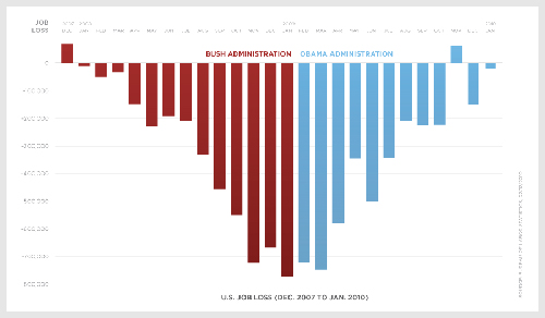
[A much bigger version of this chart can be found at my.barackobama.com, big enough to read the fine print.]
I led off today's column with a chart, not only because it's such a dandy chart, but also to prove a point. Visuals draw people in. If I had written this article in a different way, the chart would have appeared further down in the article, or even at the bottom. But then, fewer people would have seen the chart, because a certain percentage of busy folks only read the first few paragraphs of any article, before losing interest and moving on to other news. By putting it up front, more people will see it, simple as that.
Which is a good thing, because this chart is worth 1,000 soundbites on "the stimulus" or "the recovery act" or "jobs jobs jobs" or the "jobless recovery" or the "economy" or the "jobless situation." It paints a pretty clear picture: Things got bad, but they are getting better -- they're not great yet, but things are headed in the right direction. Which, on the anniversary of the stimulus bill's passage, is exactly the message the White House is trying to send. Not rosy-colored optimism, exactly, but a sense that things are indeed heading towards a better place, and away from a very bad place.
But, the excellent political savvy of this chart aside, my larger point is on how people perceive the way things work in Washington. Perception, in politics especially, quickly gels into political reality. Which is why the entire concept of "framing" issues correctly is a very big deal in the political world.
Anyone who doubts this is true need only look as far as a recent poll on allowing gays in the military. Or, should I say, "homosexuals in the military"? No, I should not. Here's why.
CBS News and the New York Times released a poll last week on the issue. They asked Americans: "Do you favor or oppose gay men and lesbians being allowed to serve openly in the military?" The responses were pretty positive:
Strongly favor -- 51%
Somewhat favor -- 19%
Somewhat oppose -- 7%
Strongly oppose -- 12%
And then, in the very same poll, they asked the same question but substituted the word "homosexuals" for the phrase "gay men and lesbians." These are the results they got:
Strongly favor -- 34%
Somewhat favor -- 25%
Somewhat oppose -- 10%
Strongly oppose -- 19%
The favorable/unfavorable numbers went from 70/19 to 59/29 just on the wording of the question. "Strongly favor" went down by 17 points. This is the most obvious proof I've ever seen of the importance of framing issues politically. You cannot even argue that the disparate results were because of methodology problems with the surveys, because it was the same survey (it's not a matter of Gallup versus Rasmussen, in other words). What it proves is obvious -- Americans, in general, are more comfortable with the idea of "gays and lesbians" than they are of "homosexuals" -- even though there is no difference between the two.
The skill of framing things correctly is about to hit center stage in the American political scene, which is my real reason for writing today. President Obama is convening a health reform "summit" meeting in about a week's time. And it will be televised live on C-SPAN.
In the dawn of C-SPAN's existence, the advisability of televising the proceedings from the floors of both houses of Congress was fervently debated. There was a fear that having cameras in the room would "change the debate," and make it more partisan. Now, I would hesitate to draw too many conclusions from the introduction of the cameras (such as "we're more partisan now, therefore it must be as a result of the cameras"), I have to say that the debate has indeed changed in at least one tangible way -- call it the Kinko's Effect. Members of Congress soon realized that to achieve their main goal (getting their faces on the evening news), it helped to bring props with a visual impact. Big charts and graphs, that sort of thing.
This "playing to the cameras" is exactly what the folks who didn't want C-SPAN cameras in Congress were worried about -- the fact that because they were being observed by cameras, it changed how elected officials presented their case.
Which, as I said, is about to be on full display. Obama will sit down next week with the leaders of both political parties in both houses of Congress, as well as technical and budgetary experts, in a last-ditch effort to hash out a health reform bill. Republicans, not to be outdone, have just proposed a similar meeting with Democrats on the issue of jobs, also with the C-SPAN cameras rolling. Meaning we could be in for a period where these types of televised events are staged regularly (especially since it's an election year).
Now, cynics on both sides decry this as a "cheap political tactic" or "political theater" which won't get anything actually accomplished. My response to such critics is: So what? If it's good political theater (from either side) then perhaps it will have the effect of moving the debate among the public at large -- which, at this point, would actually be an accomplishment. My only suggestion for Democrats is that if they take the Republicans up on their invitation to a televised "jobs summit," then they really should bring along a giant blowup of the chart I started this column off with, and hang it up prominently behind them (at a convenient angle for the cameras to pick up). Because Democrats would benefit if more people saw that chart.
Televising legislative negotiations is, perhaps, an idea whose time has come. It's easy to sell the idea as "letting in some sunshine to backroom Washington deals," but it carries with it certain risks. It's risky for both sides, because it will indeed be a competition between different ideologies and nobody can predict who will wind up looking better in such a clash of ideas. Or, at the very least (and most cynical): "clash of soundbites."
Another way to put it is: uncertainty itself is a function of being observed. This was postulated long ago on the subatomic level by the scientist Werner Heisenberg. His theory, now known as the "Heisenberg Uncertainty Principle," or the "Heisenberg Effect," is fairly easy to understand, even though it is a core basis for the entire field of quantum physics -- you can measure where a subatomic particle is, or you can measure how fast it is moving; but you cannot measure both at the same time. Momentum or position can be accurately measured, but not both simultaneously. This is because the very act of observing the particles actually influences the particles themselves. For the first time, in science, the scientific observer became not a detached presence, but one who influenced what he or she was observing. In the simplest of terms, watching something changes what it is you're watching.
On the macroscopic political level, this still rings true. Because C-SPAN will be in the room while Obama sits down with the leaders of Congress, it will influence what is said and how it is said. "Closed door" and "open door" discussions are different. But just because this is true doesn't mean the experiment isn't worth trying. Maybe it'll be a failure for one side or the other. Maybe it'll just be a failure altogether, influencing no one and changing nothing. But how is that any different than if the experiment weren't tried?
I started off this column by presenting a great visual way to recap the last two years of unemployment, just because it was a great chart and I wanted as many people as possible to see it. I am finishing it by discussing quantum physics and uncertainty. Neither "quantum physics" or "uncertainty" would likely poll well as being subjects of wide interest to most Americans, I should point out. Even among those of you who clicked on the article knowing who Heisenberg was in the first place, most likely.
If I were writing this article to be read by a select audience in a small and very targeted publication, I might have reversed the order in which I presented things. Because I wanted as wide an audience as possible, I wrote it the way I did. I'm not immune to the Heisenberg Effect either, in other words. Because I know in advance that I'm "being observed," I changed my presentation.
But, to close, I maintain that my main theme ("just because C-SPAN will be in the room does not mean televised political meetings are a bad thing") would have likely been the same no matter how I chose to structure the actual writing. You do what you can to get your message across. Which means I will be very interested in seeing the results of Obama's summit next week (if there even are any, whether tangible or intangible), and also seeing whether the idea of televised summitry will indeed catch on in Washington or not in the near future. Whether I, as one individual, will change the experiment by watching is highly doubtful, but whether a whole bunch of people pay attention or not will indeed influence both how the first summit goes, and whether there will be more of them or not.
Of this, I am certain -- Heisenberg or no Heisenberg (actually, that's more of a question for Schrödinger, now, isn't it?).
Cross-posted at The Huffington Post
Follow Chris on Twitter: @ChrisWeigant
-- Chris Weigant


I am hoping that C-SPAN will have a record number of viewers on the 25th and that they will spread the word to others. I would like to see people taking a greater interest in how the country is run and realize that we need active citizens who will make their views known at the ballot box.
Great chart!
...Stan
O, Chris, I've been trying to let it pass, but I just can't (too much of a science geek). The Heisenberg paragraph started off fine, got halfway through, then started to veer off into Woo City. I get the point you're making, but Quantum Mysticism isn't a good way to make it. Leave that stuff to Deepak Chopra.
Heisenberg never meant anything more than you can't measure both position and momentum simultaneously. Imagine you're taking a picture of a pingpong ball flying past. If your camera has a tightly focused lens, and a fast shutter speed, you'll get a good sharp picture of the ball, but there's no way you can tell from the image alone where it came from, where it's going, or its velocity. On the other hand, if you're using a very slow shutter and a badly focused camera, you'll only get a blurry streak on film, from which you can make a decent measure of the ball's velocity, but no more than an estimate of its probable position during the exposure. Changing the way you make the measurement doesn't change the particle, just the information you can get. This really matters in particle physics, but you can't extrapolate to the macroscopic level because a real pingpong ball has so many particles that when you calculate all the possible ways all the particles can go, the least probable events cancel each other out and you're left with a ball that follows the laws of good old Newtonian physics. Which means if you can't hit a pingpong ball, Heisenberg's not to blame. (Not that quantum physics is easy to understand, but a lot of the pop misunderstandings happened because Neils Bohr was almost more of a poet than a physicist, and would publish things that drove Heisenberg up the wall.)
However, it's certainly true that people's behavior can change when they're being observed, but this has to do with the reinforcing or punishing consequences of their behavior. It's much easier to pull off the usual shenanigans when nobody but your buds in Congress are around to see it, mainly because they run on the same contingencies of reinforcement you do. But when the cameras are on, they're more likely to start getting angry email from constituents, rude videos on GooToob, snarky comments from bloggers, and maybe even a primary challenge! So yeah, cameras in the room can definitely change the outcome, but it's less due to Werner Heisenberg and more due to B. F. Skinner.
There. I feel better now. I bet when you got into the political blogging game you never thought you'd start getting comments like this! I'm hungry now; I think I'll go cook up a batch of Deepfried Porkchops.
ChicagoMolly -
(1) I bet you got the cat joke at the end, there, didn't you? The one about Heisenberg as a probability wave front? Heh. I put it there just for people like you!
(2) I wasn't trying to engage in Quantum Mysticism. I've never heard that term before, but I know exactly what you're talking about (wasn't there a silly movie all about that a few years ago? I didn't go see it, because I knew it'd be bunkum.). But the "Heisenberg Effect" is now talked about in business circles on a very macro level, because, while you're right about it being closer to BF Skinner, it's an easy way to talk about "the observer effect" in human interaction. Merely an analogy, in other words, not any sort of causal or parallel relationship between macro and micro (which, I believe, is the core of Quantum Mysticism, and is -- as you pointed out -- wrong). Physics and behavioral studies are indeed apples and oranges... or apples and "why oranges feel comfortable being oranges," more accurately
You're right that subatomic uncertainty plays no role in the macro world (good pingpong analogy, by the way), but using such semantic shorthand to describe macro effects I feel is still valid. In other words, Heisenbergian uncertainty has nothing to do with how politicians will act before cameras, but it's a pretty close analogy nonetheless -- since at the subatomic level, whatever mechanical means is used to observe the event will indeed influence the event itself. Taking the analogy in the other direction, snapping a photo of a pingpong ball in flight will not change the direction of the pingpong ball, as a massive object in space would distort lightwaves due to gravitational forces (the gravity of you and the camera is less than negligable to the pingpong ball when compared to the force applied to the ball by the paddle, and by air resistance). But at the subatomic level, the mere fact that "you" and "the camera" are there will indeed influence things, as Heisenberg taught us (since any "camera" has to operate on the subatomic level as well). Although he did have a propensity to call the reasoning of Bohr "crap" at times, you are certainly right about that.
I was a physics major, so while you can quibble with my subatomic analogies to human behavior, at least give me credit for understanding what Heisenberg was saying...
:-)
-CW
PS. I love getting comments like this! But then, at heart, I am a geek. I was watching Jeopardy the other day and yelled out "kugelblitz" when the answer was merely "black hole," for instance. My wife thought I was bonkers....
Most of what ya'all said went way over my head.. But being the SG-1 aficionado that I am, I love how you inserted Schrödinger's cat into the dissertion. :D
Michale.....
And it is a very effective way of presenting the facts, free of media spin. The chart comes from the White House
Actually, I'd argue that the chart is already "spun", just by the White House instead of the media.
The logic that it shows the stimulus worked is based upon a huge fallacy. Job losses are a finite number. There are only so many job losses that can occur before job losses must naturally (i.e. without government intervention) trend to zero. And this is not the same as the total number of people who are employed.
Put simply, unemployment does not have to reach 100% for job losses to naturally trend back to a zero baseline.
Which is all that the chart shows is happening (zero baseline).
Let me illustrate with an example. You, Chris, are manager of a supermarket, we'll call it CW Foods or something. You need x number of employees to function as a going concern. Once you dip below x, your business can no longer run efficiently enough to turn a profit, you will lose money and eventually go bankrupt.
This is the number of people to successfully do the following:
1) Order sufficient stock. This means stock controllers, delivery drivers, people to put the ordered stock in the stock room and ensure everything is easy to find.
If you don't have enough stock, you will never sell enough to make a profit (once all your overheads are taken into account). If you can't find the stock, it's almost as bad as not having the stock in the first place, as you can't really sell it efficiently. Stock that's perishable could go bad before you have a chance to sell it, for example.
2) Stack shelves. You need to ensure that the shelves are reasonably full. In an ideal world you'd want them 100% full but when times are tough you can cope with perhaps 70% full or thereabouts (I'm not a supermarket manager so I don't have specific numbers, but I know enough to know empty shelves are bad).
If your shelves are empty, you won't sell as much. People won't always stop and ask the staff if there's stock in the back, and even those that do might not be able to find a staff member if you're understaffed and overly busy. So you'll lose money.
3) Check people out. No, that doesn't mean leering at the good looking folk.. I mean, of course, checkout staff to allow people to pay for their goods and leave.
People will get impatient in long lines and may just leave without their goods.
That's leaving aside all the smaller roles like security staff etc. Anyway, when times are good, your custom levels tend to go up (people buy more "stuff", even if they don't need it. We can bemoan this materialism, but it is what defines capitalism, and in particular, America).
This means you have more money to hire so you hire above the level of x. Let's say you hire x+9. Why would you hire more instead of just taking the added profits and putting them in your pocket? Because those extra staff will mean even higher profits for you, exponentially, medium-to-long-term. How? Because:
1) You can order more stock and still keep a tidy and well-run stock room. Since you have more customers buying more "stuff" you'll want to order in more stock to keep them satisfied. So you need more stock controllers and procurement staff.
You want to make the most of the increased custom to sell as much as you can.
2) You can keep your shelves fuller. You can actually even aim at that 100% mark.
As a man whose parents ran shops, I know full well that the fuller the shelf is, the more you sell, not merely because there's more stock, but because a fuller shelf tends to draw in the customer to buy something they might not otherwise buy.
3) You can have more checkout staff. You'll have more customers, and that means longer lines. Remember what I said about people getting impatient?
Higher turnover of customers also means you can serve more people before you close for the day, although this is mitigated by the maximum level of demand.
Anyway, when things go badly, you need to look at ways to save money. Job cuts are obviously an easy target. So you let those nine extra people go. However once you've let those nine people go, you cannot let anyone else go without adversely affecting your business. If you do make further job cuts, you're hindering your ability to "ride out the storm" and come out the other side as an ongoing concern.
You will likely go bankrupt. So you stop cutting jobs.
Now you'll see that if every workplace followed the same formula (and, except for those that actually did go bankrupt, they would have done) there will come a point (the x value for each workplace) at which the unemployment level has peaked. At this point you can lose no more jobs without hurting your business.
All that chart shows is that the US has hit this level. Note, there was only one month in which employment ticked up on that chart, and that was the month of November, when a lot of employers take on extra seasonal staff for the holidays. The following month there was a massive drop again. The stimulus could very well have helped the economy reach that point, but there is no reason to presuppose it did. It's just as, if not more, likely that it simply trended to zero naturally, as it was always going to do. Given the massive losses that took place under Bush, I'm inclined to believe that enough jobs had been lost that the trend to zero had to take place. I just couldn't see the old trend continuing.
All of that analysis doesn't even factor in "underemployment", that is either people who are working in jobs for which they're overqualified (think a doctor who delivers pizzas), people working in part time jobs when they really need full time or people who are unemployed but have actually given up hope of finding new work. What a lot of people don't seem to know is that the effective rate of unemployment is actually much higher than 9.7%. It's running at closer to 20%. Under Bush this same figure was only 10% (the rate of underemployment goes up the longer someone is unemployed for). True, this isn't Obama's fault, per se, but it does undermine the idea that Obama's administration has helped job growth.
The proof is in the figures. In January payrolls went down. That means the total of all the payrolls in the US went down meaning less money was earned by employees. Meanwhile unemployment went down too. This can only mean one thing; greater levels of underemployment. If unemployment had actually gone down, those new employees would have to be reflected in a higher payroll number, otherwise where did the money they earned go? It didn't disappear.
Like I said, I'm not sure that graph paints any sort of rosy picture of things getting better. All it means is things aren't getting any worse. Less job losses is nowhere near the same as job increases. Trending to zero is not job growth. All it means is that the unemployment market bottomed out. Whether this was due to government policy or natural bottoming out, that chart is silent on that issue.
Now I'll grant you that the chart is a very good selling point, and a perfect framing tool for the Obama administration. People probably will "buy" it, unless the other side are savvy enough to be able to explain why it's a false picture. We'll see if they are. Like you pointed out with the CBS poll (which I actually spotted last week and linked in one of your comments, I think), framing is everything in politics. So I think the chart works well as a political tool, but those of us who understand it ought to understand why it does nothing to further Obama's argument that he's helped job creation.
Woah, I went a little overboard with the bold. Never really notice it as you're typing it just how often you're using it. I wasn't shouting, don't worry ;-)
I was thinking along the same lines, vis a vis the accuracy of the graph..
However, I wasn't going to say anything because CW wasn't using it to make a point about jobs, but rather using the graph (or ANY graph) to make the points the Democrats want to make.
THAT aspect of the commentary is logical and therefoe I saw no need to comment.
However, since the accuracy of the data itself has been raised, here is my 2 bits.
These types of graphs/polls/announcements have very little meaning in reality.
Take, for example, the constant shrill screams coming out of the White House in the last year regarding the number of jobs "created" or "saved" by the stimulus. Yet, as it came to pass, error upon error had piled up, showing that the figures released are utterly BS..
"Oh, well, that was just a small accounting boo boo" was the standard response from Obama et al..
But iddn't it funny how all of those "accounting boo boos" served to paint the jobs stimulus in a better light?? If there were TRUE "accounting boo boo"s, as the WH claimed, surely there would have been boo boos that would have gone the other way, no??
What has become apparent is that this administration will latch onto ANY number, ANY position or ANY point...
As long as it paints the Administration in a good light...
REGARDLESS... Regardless of the accuracy of said number, position or point.
What's my point??
Simple...
You can't believe ANYTHING coming out of the Obama administration anymore..
If the White House told me that ice is cold, water is wet and the sky is blue, I would have to confirm that thru other sources before I believe it.
Michale.....
Moderate -
Speaking of micro/macro problems...
A few comments. First, your example is likely correct as far as it goes (I've never run a store, so I'm not going to quibble with it), but it simply does not go far enough.
Because the store can fail. Meaning it will indeed reach a level where 100% of its employees are now unemployed. Also, it can ship a bunch of jobs overseas (OK, the "store" analogy kind of falls down here). Both of these happened widely in the past two years. But, in your analogy, you ignore these lost jobs, because you seem to be assuming that all US businesses merely shrink until they can't shrink any more, and then rebound. This is simply not true -- there's no law (unless you're a bank, of course) that says you can't fail.
And good luck with the argument, in the political arena, that "this would have happened anyway, it's just sheer coincidence that Obama took over exactly when things were about to get better." Because even advancing this argument undermines the GOP, because it draws attention to the fact (which many haven't even noticed). So, like I said, good luck with that argument, politically.
Michale -
You say:
What has become apparent is that this administration will latch onto ANY number, ANY position or ANY point...
As long as it paints the Administration in a good light...
REGARDLESS... Regardless of the accuracy of said number, position or point.
This is a truism, if you'd only change "this administration" to "any administration." It's the nature of politics, in other words. Numerous examples from Bush (or Clinton, or Reagan, or ANY president) are easily available.
Both of you -
I have long maintained that the business cycle is largely independent of politics. And that most economists are wrong, most of the time, simply by the nature of their work.
Politicians, presidents especially, either get way too much credit or way too much blame for how the economy's doing. So I'm not praising Obama and bashing Bush here at all, because I think there are larger factors involved than what happens in DC.
Also, I frequently admit that the economy is too big for any one person (and certainly not me) to know precisely what happened, what is happening, or what will happen.
So I think we're largely in agreement, at least on the overarching issues here.
BUT (you just knew there'd be a "but" didn't you?) this is the way politics happens. Presidents do routinely claim credit for these things. And everyone goes along with it. So, politically, my point is that the chart is a dandy one because not a whole lot of explanation is required for the average person to understand it. Whether they draw incorrect conclusions or not is beside the point -- the chart as a chart is a good one, which is why Democrats should use it, because it counteracts arguments from the other side (even if both Dem and GOP arguments are largely wrong).
In other words, Dems can claim the recovery act did wonders, and GOPers can claim "it would have happened anyway" and the public can make up its own mind -- but the chart helps the Dem argument. You've got to at least admit that, no matter what side of the issue you're on.
I find it interesting that the "true unemployed" number is being used now, with a Democratic president, when I have NEVER HEARD THIS NUMBER USED BEFORE NOW. Nobody talked about it when Bush was in office, nobody talked about it that I can remember at any point. But now, suddenly, everyone wants to talk about it because it makes a Dem look bad. It just seems fishy to me, that's all. And while it hit around 17%, it also fell back last month to sixteen-point-something.
The real danger, and the reason why Dems aren't making more of a big deal of things, is that things could turn around again or the good numbers in the past few months may just be a statistical abberation. If the next two months worth of unemployment numbers are good, then look for Dems to start saying a lot more strongly "we saved the economy," that's my guess anyways.
The thing that most people miss (and almost all politicians and political commenters, for that matter) with unemployment is that as a business owner, I don't hire people based on who is in the White House, or what Congress is doing, or taxes, or whatever -- I hire people when I have the workload to justify the hires. If I make widgets, and I'm getting swamped with widget orders, I hire more people to make them. If there are no orders, I think about firing people. This is both what I mean when I talk about the economy being largely divorced from the machinations of politicians, and also what Moderate was talking about in his example, I think. Jobs appear when products are moving off the shelves. They disappear when products are rotting in the warehouse. Regardless of what politicians are doing.
And, finally, Michale, isn't there a Star Trek episode or two on "the Observer Effect"? That's the Heisenberg Effect by a different name...
-CW
And, finally, Michale, isn't there a Star Trek episode or two on "the Observer Effect"? That's the Heisenberg Effect by a different name...
OK, you asked a Trek question.. All other considerations go out the window.. :D
There were many examples of the Observer Effect throughout Trek history...
STAR TREK 9: INSURRECTION is the first example that pops into my head.
PATTERNS OF FORCE and PARADISE SYNDROME were good examples of "observer" episodes from TOS..
A few from TNG, but the names escape me.
But I think the best (and most underrated) "Observer" episode was from Star Trek:Enterprise. Which is the one you are probably referring to because it was called "THE OBSERVER EFFECT"... :D
It's a prequel (of sorts) to the TOS Trek Episode that introduced us to the Organians (ERRAND OF MERCY)..
I love the episodes of the newer Treks that references things from TOS.. Gives us the feel of a Trek universe.. :D
"Did you want to talk about the weather? Or were you just making chit-chat?"
-Bill Murray, GROUNDHOG DAY
:D
Michale...
Because the store can fail. Meaning it will indeed reach a level where 100% of its employees are now unemployed.
True, and I accepted that. But applying the analogy to a chain of stores, even if one accepts closure of y stores can keep the business profitable, those stores are still subject to the minimum staffing requirement.
Also, it can ship a bunch of jobs overseas (OK, the "store" analogy kind of falls down here)...But, in your analogy, you ignore these lost jobs...
Actually those lost jobs overseas only increase the validity of my argument. There are still a finite number of jobs that can be lost, however they're lost, before a business becomes no longer viable. The job losses cannot continue forever, which was actually the overall point I was making.
all US businesses merely shrink until they can't shrink any more, and then rebound. This is simply not true -- there's no law (unless you're a bank, of course) that says you can't fail.
Of course there isn't. But my point wasn't that businesses "rebound". Note, the chart only shows less jobs lost; it does not, necessarily, equate to any sort of bounce in the economy, just that there comes a point at which you can no longer slash 800,000 jobs in a month and still have any semblance of a working economy. The number of job losses possible is still finite.
At a certain point either the job losses become systemic (which means no amount of stimulus is going to bounce it back within a year) or they flatten, and actually all that chart shows is flattening (trending back to zero). There is a huge difference between what appears to be an uptick in employment and the underlying employment rate (which is higher now than under Bush) so the chart doesn't show what it appears to.
All that being said, however, I agree with you. Undermining the chart in any sort of political way is going to be an uphill battle, which I think I accepted in my closing remarks earlier. I think the chart is a great framing tool.
Politically the chart's great. I just had to take issue with the impression that it shows the economy improving, which I don't think it does. Of course the average American will probably look at that chart and believe the economy is improving, which is precisely why it's a great political tool.
In other words, Dems can claim the recovery act did wonders, and GOPers can claim "it would have happened anyway" and the public can make up its own mind -- but the chart helps the Dem argument. You've got to at least admit that, no matter what side of the issue you're on.
Exactly. I agree with every word of that. The truth is, I'm worried about that chart precisely because I think it's a) misleading and b) damn good at being misleading (i.e. the public will, by and large, believe the argument that the Democrats attach to it).
I find it interesting that the "true unemployed" number is being used now, with a Democratic president, when I have NEVER HEARD THIS NUMBER USED BEFORE NOW. Nobody talked about it when Bush was in office, nobody talked about it that I can remember at any point.
Actually market analysts have been using that figure for years. Trust me, I'm a fairly active stock market trader (as a hobby) and it's exactly the indicator used by those who want to know the true state of the economy. I certainly did pay attention to it under Bush, and like I said, I do give credit that it's not actually Obama's fault. It's simply economics in action; the longer the unemployment rate keeps going up, the larger the gap between measured unemployment and true unemployment gets.
Think about it, if you're a well-paid banker at Bear Stearns, lose your job, and can't get another one because banks are reluctant to take on new staff, eventually you've still got to pay the rent. So you'll take any job going. Which is why you end up with underemployment. Also, the more dire the economic situation, the more reluctant people are to even look for work. In December 2008 things were bad but not as bad as now. That's not Obama's fault, per se, it's just that the crisis hadn't really been "felt" until now.
To be fair, it's worth bearing in mind that many of these "analysts" who use the figure are, traditionally, Republican. Rick Santelli, for example, talked a lot about the Tea Party on CNBC, and he's long been a fan of using the true unemployment figure (even under Bush. Santelli was never a big Bush fan).
It's unfortunate for the Democrats that this demographic effect exists, but the figure is certainly a long-standing measure used by market analysts.
The real danger, and the reason why Dems aren't making more of a big deal of things, is that things could turn around again or the good numbers in the past few months may just be a statistical abberation.
Statistical aberrations occur a lot with unemployment figures. It's safer to wait, and like you, I think we'll see a lot more made of this over the year.
The thing that most people miss (and almost all politicians and political commenters, for that matter) with unemployment is that as a business owner, I don't hire people based on who is in the White House, or what Congress is doing, or taxes, or whatever -- I hire people when I have the workload to justify the hires.
Pretty much. Taxes can have an impact on demand (if people actually spend their tax cuts rather than save them), and taxes on capital gains can push a business owner to invest in new assets (factories etc) but yeah, the economy doesn't really depend much on the political world. One way government can help is by restoring confidence, and that's where regulation can help.
This is both what I mean when I talk about the economy being largely divorced from the machinations of politicians, and also what Moderate was talking about in his example, I think.
It was indeed. I wasn't giving Bush any credit for unemployment levels either. Economics is driven by supply and demand, and there's little politicians can do to make an economy "recover".
Note, my well-paid banker at Bear Stearns example wasn't an executive. Those guys bonuses mean being laid off is irrelevant. I'm talking the mid-level guys who still make handsome salaries but splurged on silly stuff like yachts and fast cars and fancy houses that they now can't afford.
Idiotic, granted, but the example still holds. And I chose Bear Stearns for two reasons. One, it went under, largely because of the idiocy of those who worked there. And two, its initials are BS. Which is what I think the chart is, economically speaking ;-).
Sorry, but CW pushed my Trek button and now I am single-mindlessly focused for at least 24 hours.. :D
The Crew Of The USS ENTERPRISE Beams Down To CPAC To Save The Day!!
http://www.foxnews.com/static/managed/img/Lorisa-Hilburn-FL_slideshow_604x500.jpg
Michale.....
In other words, Dems can claim the recovery act did wonders, and GOPers can claim "it would have happened anyway" and the public can make up its own mind -- but the chart helps the Dem argument. You've got to at least admit that, no matter what side of the issue you're on.
Yes, I would certainly agree that the chart does help the Democrats...
My only point (and I think Moderate's as well) is that it doesn't accurately portray the reality. As Moderate said, it's simply "spin"..
Very good spin, to be sure.
But spin nonetheless..
Michale.....
Yep, that's exactly my point Michale. It's spin. Very good spin, but still spin.
Not that the GOP don't play the spin game either.
I just realised something else. Shouldn't the chart be inverted? After all, the y-axis is meant to represent job losses. Yet if one were to read the chart as it is, one would come to the conclusion (wrongly) that there were -800,000 job losses (i.e. 800,000 jobs gained) in January 2009.
That's yet another example of spin. If one is measuring job loss one should use the positive side of the y-axis to indicate greater job losses with a higher bar, and lesser job losses with a lower one. That, however, would make the chart less useful as a framing tool, because it wouldn't show a "bounce". It would show up the whole "things are getting better" argument as being more accurately "things aren't getting worse".
(Of course there wasn't a bounce; if one used a line graph of the jobless level one would see it flattening out, not trending downwards.)
Unfortunately most of the electorate wouldn't understand that a peak in job loss under Bush and a drop in those figures after that point is a good thing; they'd probably assume that bigger bars = better. Hence inverting the chart.
Clever.
OK, I have to speak up for the chart-as-a-chart here. But let me take things sequentially...
Moderate -
You write:
Actually those lost jobs overseas only increase the validity of my argument. There are still a finite number of jobs that can be lost, however they're lost, before a business becomes no longer viable. The job losses cannot continue forever, which was actually the overall point I was making.
But this is not true. This undercuts your reasoning. A job shipped overseas by your "store" is not a job "lost," as you are figuring the "minimum jobs needed" for the business to run. That job is still being done. The net cost to the business is actually less (due to cheaper labor costs) but the negative net cost to the American economy is twofold: both a job lost (higher unemployment) and lost income tax revenues from the worker who used to do it. In a lot of businesses, there is no finite number of jobs which cannot be done cheaper overseas. This doesn't change your equation of minimum jobs for that business to be viable, but it does change the American labor market figures.
Also:
Of course there isn't. But my point wasn't that businesses "rebound". Note, the chart only shows less jobs lost; it does not, necessarily, equate to any sort of bounce in the economy, just that there comes a point at which you can no longer slash 800,000 jobs in a month and still have any semblance of a working economy. The number of job losses possible is still finite.
But the American economy has no guarantee of remaining viable, either, which you seem to posit as some sort of general axiom. There's no law that says we have to have "the semblance of a working economy" -- which is Obama's point, that that's precisely the catastrophe he avoided. The number of job losses possible is finite at precisely the number of jobs which exist in America. No less.
As for the "true number of unemployed" I guess the reason this bugs me is the difference in the way Europe figures unemployment and the way the US does. Because benefits are greater and more humane across the pond, they tend to count everyone not working a lot better. This leads to all sorts of demogoguery here as to "rampant unemployment in Europe" even when they're really about the same as our numbers. So it was kind of a surprise to see people paying attention to this now, but my political radar was triggered by the question: "why now?" Probably just me, I fully admit...
But seriously, both of you guys, the chart's just a chart. It shows factual numbers. It is not (other than, perhaps, the coloration of the Bush and Obama months) "spin" in any way, although I certainly do admit that the chart could be "spun" by politicians using it to make their case. But the chart itself is objective reality. It is factual, not political, in other words.
As for the label, phhbbbtt... PUH-leeze. OK, it could have been labelled better (note, in deference to Moderate's Britishosity, the double-"l" in that word, please). Perhaps "monthly job change" or something. But again, good luck arguing that negative should really be positive. Negative numbers are traditionally lower on the y-axis, in just about every chart known to mankind. Negative = "down." Positive = "up." Deal with it.
The chart itself stands on its own, that's my point. High-blown and over-spun political interpretations of it (and the causes of what the data show) are fair game for political attack, but the chart per se is a dandy chart of objective data reported by non-partisan sources. Deal with it.
:-)
-CW
This doesn't change your equation of minimum jobs for that business to be viable, but it does change the American labor market figures.
Ok, I'll take that criticism of my model.
But the American economy has no guarantee of remaining viable, either, which you seem to posit as some sort of general axiom. There's no law that says we have to have "the semblance of a working economy"
No, but you do have a semblance of a working economy. Heck, on the basis of your GDP figures, even in the worst of the "crisis" the economy still functioned well enough to avoid double digit GDP contraction.
which is Obama's point, that that's precisely the catastrophe he avoided. The number of job losses possible is finite at precisely the number of jobs which exist in America. No less.
Except, as I pointed out, once you reach the level of systemic job losses, no amount of government action can stimulate the economy within a year. So either there was no systemic job loss (which means that the economy did remain viable and therefore the "bounce" would always happen naturally and there was no catastrophe to avoid) or there was and there's been no "bounce" and the catastrophe hasn't been avoided. Take your pick ;-).
Besides, I'll go back to the only fact we know: true unemployment is now double what it was when Obama took office. That's an incontrovertible fact.
As for the "true number of unemployed" I guess the reason this bugs me is the difference in the way Europe figures unemployment and the way the US does. Because benefits are greater and more humane across the pond, they tend to count everyone not working a lot better.
Yep, we're a lot better at counting, which is why we can trust the official figures to be accurate indicators. In the US the real figure to watch is the payrolls, and as I said, they continue to go down. That can only mean one thing; underemployment, especially in light of the unemployment rate actually dropping. If more people are employed but they earn less, that's underemployment.
But again, good luck arguing that negative should really be positive. Negative numbers are traditionally lower on the y-axis, in just about every chart known to mankind. Negative = "down." Positive = "up." Deal with it.
Oh, that wasn't my problem at all. I agree that negative=down and positve=up, but then I think it should be re-labelled. If it were labelled "job change" I'm not sure it would have the same political impact, because then the chart would simply show greater change under the latter part of Bush's Presidency, and under the start of Obama's, and less change under Obama.
It wouldn't, however, show anything positive (like I said, less negative, but not positive) about Obama's stimulus. It would show, as I've said all along that it shows, that the jobless situation has trended to zero, but that only trending to zero (rather than trending in the positive) does not equate to job creation, only to less job loss (a flattening of the curve).
For me the labelling is part of how it's been spun. Why not, for example, chart the unemployment rate? If they did, all it would show is that the rate has flattened. Sure, that's "better than Bush" but is that really all that Obama is aiming for? What happened to all that "Hope" and "Change"?
;-)
PS: I appreciate the hat-tip to my Britishosity.