
Unemployment, Presidential Approval, And The New Republic
Are presidential approval numbers tied inexorably to the state of the economy, as measured by the unemployment rate? That is the question The New Republic tries to answer in a recent article, which comes complete with graphs purporting to provide an unequivocal answer. Unfortunately, while they do present their case, they also undermine it by cheating a bit with the statistics themselves, and a very selective process for choosing which numbers to examine. Meaning the only answer we can adequately take away from the article is: "possibly."
Now, normally, I choose to limit my commentary on presidential opinion polling to once a month, in the "Obama Poll Watch" series. But this was so interesting (and, truth be told, the charts drew me in -- I'm a sucker for a political article with numbers and graphs, I fully admit) that I thought it was worth looking at the case the article's charts present, and their inherent flaws.
The charts start on page 2 of the article, which has a chart mapping the disapproval rate during Ronald Reagan's first term and Bill Clinton's second term to the unemployment numbers at the time. There is one more chart, on page 3 of the article, which shows Barack Obama's disapproval rate and unemployment, to date.
But before I begin getting picky with each chart individually, I have a few general observations. One wonders immediately why only Clinton and Reagan were used, and why Clinton's second term was used instead of his first (more on that in a bit). The article references Franklin Delano Roosevelt as well, although there were no accurate public opinion numbers for F.D.R. (public polling was in its infancy back then, or perhaps "its embryonic state" would be more accurate). The article also mentions Truman, Carter, both Bushes, Eisenhower, and Kennedy -- but provides no charts for any of them. Broken down term-by-term, we've had over a dozen presidential terms to use as examples, of which we get two. One wonders why this wealth of data was ignored. It could be, of course, due to publishing and space limitations for the article -- always a possibility. But after looking at the charts in detail, one can't help but wonder if most of the ignored presidential terms just didn't match up with the proposition the author is trying to make.
One also wonders why disapproval numbers are used, rather than the more commonly-referenced approval numbers. This, however, has a fairly benign explanation, one assumes -- the disapproval line would tend to match up well with the unemployment trend on the graph, whereas the approval line would be a mirror image -- making it harder to see what the author is talking about. And, after looking at the approval and disapproval lines for Reagan and Clinton from my own data, nothing ominous is hinted at -- since while their approval and disapproval lines show minor inconsistencies, both largely form an exact mirror image (as disapproval goes up, approval goes down, and vice versa, with no large anomalies in either chart from this general rule).
But it's still a fairly heavy accusation to say the author is cherry-picking his data to fit his theory, so allow me to explain why these charts leave me with more questions than they answer. Taking them in the order they appear, we first are presented with Reagan's first term.
The author is obviously using different numbers than I have been using (Gallup, in this instance), showing up in minor deviations in the graph, but overall, the graph I have for this period shows the same arc for Reagan's first-term disapproval numbers (pink line):
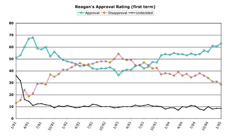
But take note of the scales in the Reagan graph in The New Republic (there are two scales, due to two different lines being charted together). Disapproval, in all three of the charts, is scaled from below 10 to above 50 percent. Now note how the unemployment scales match up. Across from 10 percent disapproval in Reagan's chart is roughly four percent unemployment. At the top, 50 percent disapproval maps to about 10.5 percent unemployment.
Now take a look at the graph below Reagan's in the article, mislabeled: "Clinton's second term." The scale here is radically different. This time, 10 percent disapproval is mapped to two percent unemployment, and 50 percent disapproval is even with a measly six percent unemployment -- far different than on the Reagan graph. On Reagan's graph, two percent unemployment maps to around zero percent disapproval, and six percent unemployment is at about 25 percent disapproval.
This is a far different standard, to put it mildly.
The other problem with the Clinton graph is that it shows six years, not four. It starts around halfway in to Clinton's first term, and includes all of his second term as well. Here are my graphs for Clinton's two terms:
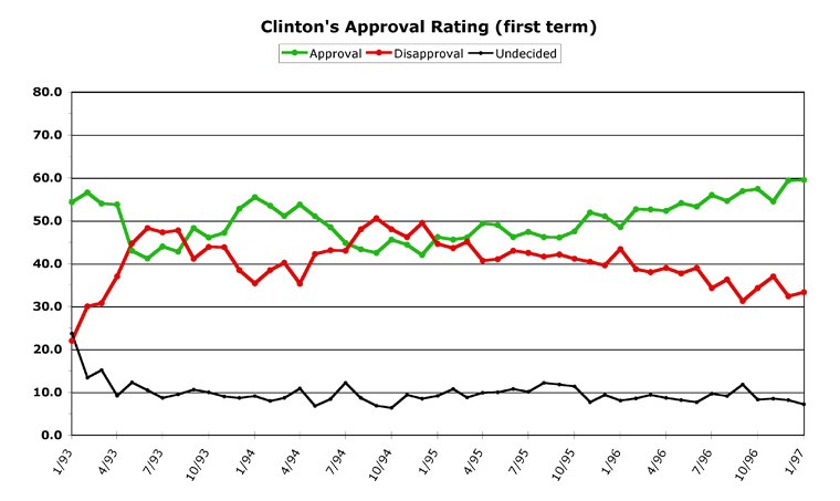
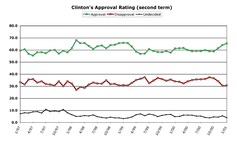
As you can see, the first two years of Clinton's term had his numbers swinging wildly up and down. So the author took as his starting point the peak of Clinton's disapproval, at the beginning of 1995, and decided to ignore Clinton's first two years (assumably because the lines wouldn't match up nicely and support what he's trying to say). The other thing which jumps out at you is the difference between my graph for Clinton's second term, and the graph presented in the article. In mine (which averages many opinion polls, not just Gallup), Clinton's second term is stunning in its consistency. Clinton's disapproval rate stayed within a 10.4 percent range his entire second term -- during the whole Lewinsky mess. His disapproval when he was sworn in for a second time (33.3 percent) was within three points of where it stood when he left office (30.6 percent). His disapproval skirted 30 percent his entire term, and even dropped below it for three months, in early 1998.
Now look at the article in The New Republic again. Clinton, in this chart, begins his second term (beginning of 1997) at around 37 percent disapproval. But, rather than the stunningly flat slope shown in my graph, his disapproval numbers decline gradually over his entire term -- without a single uptick -- until he leaves office at around 26 percent disapproval. The same 11-point swing, except this time it perfectly shows what the author is trying to prove. How convenient.
Moving on to Obama's chart on the next page of the article, we see that the scale has changed once again, to shoehorn the data into the argument the author is trying to make. Now, 10 percent disapproval equates to 7.5 percent unemployment, while the 50 percent disapproval number goes back (roughly) to matching Reagan's chart, at around 10.5 percent. Once again, how convenient.
The author's disapproval numbers for Obama are close enough to the graph I have, with one major difference. Now, what with the lead times some publications have for articles, there may be an easy explanation for this -- the author may have been using the most recent up-to-date numbers he had access to when he wrote this. But if you add one more month to the end of his timeline, it would show the two lines diverging rather dramatically. Obama's disapproval rate, as I chart it, actually went down a tiny bit from September to October. But the real movement is in unemployment, which now stands at 10.2 percent. As you can see in the article, this would be an argument against what the author is trying to prove. Obama's disapproval staying essentially flat while unemployment shot upwards -- as the final data point -- simply does not square with the article's theme. So, conveniently, it gets left out.
Which is my point in writing this -- there are a lot of things which the author has conveniently ignored in his data presentation. Ronald Reagan had a disastrous falloff in his numbers at the end of 1987, at the height of the Iran-Contra scandal (his approval rating slid from 67 percent to 46 percent in one week -- a record no other president has matched since polling began), but this does not fit into the author's theory, so it is ignored. The first two years of Bill Clinton were a wild ride in his approval polls, so they are also conveniently left off the graph. The other 11 presidential terms (or, really 10.5, since half of Clinton's first term was used) are also, for the most part, ignored. The comparison between Clinton and Reagan, who both had a big scandal in their second terms (one of which affected approval rates and one of which did not) is not made. If the scale on the graph doesn't show what you want it to show, then it's easy enough to monkey with the scale until it does show what you're trying to prove -- hey, presto, the trendlines match up exactly now!
It may surprise you that I actually agree with much of what the article is saying, which can be summed up in the Clintonian phrase: "It's the economy, stupid." I even wrote a while back that if I could see two numbers -- the Dow Jones Industrial Average, and the unemployment number -- from next October, I could accurately predict the general outcome of the 2010 elections.
I strongly believe that both Obama and the Democratic Party will be judged, in next year's midterms, on the state of the economy. Fair or not, this is the way of politics. "Are you better off now than you were two years ago?" is going to be a question on the minds of many, many voters come next November. And I likewise agree with the author that this is largely a matter of perception -- that it won't matter so much where the unemployment number stands, as much as it matters whether it is going up or going down. The trendline and the slope will be the important thing. If unemployment goes up to 14 percent, but then falls throughout the summer to 11 percent just before the elections, people may be feeling good enough about the "direction" of the economy to vote Democrats back into office. But if the number stays flat, and rises a tenth of a percent here and there, until it hits a new high of 11 percent next fall, then voters may kick the Democrats out of office. The trend is more important than the number.
But when I first saw the article, and went through my "Ooo! Charts!" moment, I was expecting some rigorous analysis of the numbers, and what they meant. Instead, I am sorry to say, what The New Republic offered up was cherry-picking and data manipulation to "prove" the author's case. I find both practices intellectually dishonest, personally. As I said, I largely agree with the point the author was attempting to make, although I wouldn't attempt to make it as strongly, rather choosing to put it as: "The economy is a major factor in presidential approval ratings, but not always the dominant factor." But the article's numbers and graphs actually convinced me not of the case the author was trying to make, but only that he could not adequately make such a case without massaging the heck out of the data.
-- Chris Weigant
NEW! Follow Chris on Twitter: @ChrisWeigant


Maybe you should start giving "Worst Poll" awards.
As I mentioned in a previous commentary, barring a 9/11, a Katrina or intense combat action somewhere, the mid-term elections will be about one thing and one thing only.
J O B S
And, since Dems seem intent on ignoring jobs in favor of Bank Bailouts and DunselCare and Scheme-n-Ream, you can bet that we're gonna see the GOP sittin' pretty after the mid-terms, despite their so-called "irrelevancy" or "demise".. :D
Michale.....
Michale -
I bet they dig in first thing, next year, personally. Dems know it the job numbers still suck, they're going to have a stiff headwind next year to beat.
The TNR article was annoying, because as I said, I largely agree with the slant of it (and your comment, M), but I was affronted by what was done to the numbers and graphs, personally.
-CW
Just wanted to say: Woo hoo!
Caught up on answering comments!
Go see the last week's worth, anyone who's been commenting unanswered...
:-)
-CW
I bet they dig in first thing, next year, personally. Dems know it the job numbers still suck, they're going to have a stiff headwind next year to beat.
You might be right. But I just can't see how Dems can do it.
I mean look at it.
Chances are, DunselCare is going to extend into the new year. That is, pretty much, a forgone conclusion. Then the House is going to have Scheme-n-Ream to deal with. And on top of all THAT, Democrats are going to be campaigning their titties off, trying to hold onto their jobs.
It's a Perfect Storm of a Catch-22..
Dems will have to ignore their jobs in order to try and keep their jobs. :D
Is this country great, or what!? :D
Michale.....
Michale -
Don't underestimate the shortness of the American attention span. I couldn't tell you what Congress was doing this time last year, for instance, off the top of my head.
Elections largely hinge on the last three months of the campaign, and what is going on then. Since we have no way to know what that will be, anything could happen. That's the way I see it, at least.
-CW
Once again, it appears the White House is tapped into our conversations here at CW.COM :D
After spending binge, White House says it will focus on deficits
http://www.politico.com/news/stories/1109/29471.html
Michale.....