
Branding The Recovery
President Barack Obama is taking another page from F.D.R. (which should come as absolutely no surprise to anyone) by attempting to "brand" his recovery program for America. Addressing the Department of Transportation today, Obama unveiled two logos which will be prominently displayed to show Americans that their stimulus package money is being well spent. The first of these is a generic logo for all projects funded by the American Recovery and Reinvestment Act (ARRA):

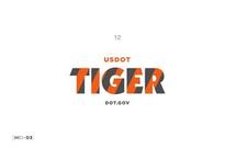
The second is specifically for transportation projects, and is a striped acronym which stands for Transportation Investment Generating Economic Recovery (TIGER):
Obama's stimulus package has often been compared to Franklin Delano Roosevelt's "New Deal," and these logos aim to build on this as well. F.D.R. probably spawned more acronyms in Washington than any other president. Some of these are still in use today, while some have become little more than a pop quiz question in American history.
A short (and incomplete) list of these: the National Recovery Administration (NRA), Federal Deposit Insurance Corporation (FDIC), Tennessee Valley Authority (TVA), the Securities and Exchange Commission (SEC), the Rural Electrification Administration (REA), the Works Progress Administration (WPA), and the Civilian Conservation Corps (CCC).
F.D.R. was no slouch when it came to "branding," in other words. But will Obama's new logos catch on with the public?
The transportation effort is not really a logo per se, but rather just a catchy acronym. OK, the stripes are kind of cool, I will admit, but the logo is nothing more than the acronym itself, so let's take a Madison Avenue look at how effective this one could become.
Tigers are already a proven value, on the consumer level. Tony ("They're GRRREAT!") the Tiger has been hawking breakfast cereal for a few generations now. Nobody minds that this is somewhat of a disconnect, since if a real tiger were to concoct a breakfast cereal it would probably be named something along the lines of: "Tasty Herbivore Flakes," or "Super Meaty Flakes." You don't see tigers in the wild out on the Serengeti stalking the wild cornflake in nature films very often. Hey, I'm just pointing it out.
The other big-time spokestiger was for Esso (and then Exxon, when they changed their name), along with the slogan "Put a tiger in your tank!" Again, somewhat of a disconnect, seeing as how what was being sold had nothing whatsoever to do with tigers. The only truly honest gasoline company logo came from Sinclair, who used a cartoon dinosaur image on their signs ("Fill 'er up with some dead dinosaur goo, please!").
But this proves that tigers are cool pitch-cats, even if they have nothing to do with the product. Meaning the "TIGER" logo will probably do just fine for transportation projects. And, in today's pop culture, when you say "Tiger," the immediate response is to think of golf's Tiger Woods. And, as far as I can tell, everyone loves Tiger Woods. Which is why his face is such advertising gold.
Which brings us to the ARRA logo. Since this is a more graphic logo than just the letters "TIGER," let's examine the image. It's got a retro feel to it, I have to say. The bottom-right quadrant looks like something out of the Industrial Revolution, or a movie poster for Charlie Chaplain's "Modern Times." The two gears are immediately recognizable, though, and convey "let's get the machine working again," at least to me. The lower-left quadrant is an image which could have been drawn in the 1970s (randomly look at just about any United States postage stamp from this era, if you don't see what I mean), combining a farm/agricultural feel with the ecology/environmental imagery of the last three decades. Over both of these is an American flag motif, with a website name to point people to recovery.gov, for more information about the recovery progress.
As a logo, it's pretty good, I have to say. It seems to project getting back to work, growth, and American confidence in one fairly simple image.
The acronym, however, could use some work. Instead of sticking with the name of the bill, how about some re-branding here? "ARRA" sounds (depending on how it is pronounced) as either something a pirate with an accent would say, or dangerously close to "error." That's not good.
But fixing it wouldn't take much. How about some cross-branding? Name it the "Reinvesting Administration for American Recovery" (RAAR), or even "Reinvesting Our American Recovery" (ROAR). Either one sounds much more like what a "TIGER" would say.
Raaargh! Roar!
-- Chris Weigant


I noted that "ARRA" doesn't appear in the logos. The emphasis seems to be on the website, which is in keeping with the move to open-source governance. Obama's pushing a very web-centric "campaign" here...
OsborneInk -
Yeah, I just couldn't resist the joke.
RAAR!
I actually like the logo. And I think it's actually a really good idea to "brand" it. Out here, when we get freeways upgraded (or whatever road project) there's always a big sign saying "Paid For By Measure A Funds" or whatever. This connects voters with the bonds they vote for, and the actual work that gets done. I think this could work well on a national scale too.
My article was kind of tongue-in-cheek, but what do folks think about the basic idea? Too crass or cheesy? Too political? Or a good idea?
-CW
I like the "branding" idea because it frames the issues and programs and makes it harder for the GOP to put a negative spin on things.
...Stan